


Heyyyy there! Welcome back to the 2nd part of the Todo App.
If you still haven't read 1st part check it here.
In this post, we are going to design our Todo App using CSS.
NOTE : To make design easy I have added a few extra div sections
Let's begin!
IMPORTING FONT
- Simply head over to Google Fonts, choose the font you like, and select styles and click on import, then copy that import link and paste it in your top of the CSS file. Here I choose Poppins font (I love poppins👀).
@import url('https://fonts.googleapis.com/css2?family=Poppins:ital,wght@0,100;0,400;0,500;0,700;1,100&display=swap');
SET MARGIN & PADDING USING *
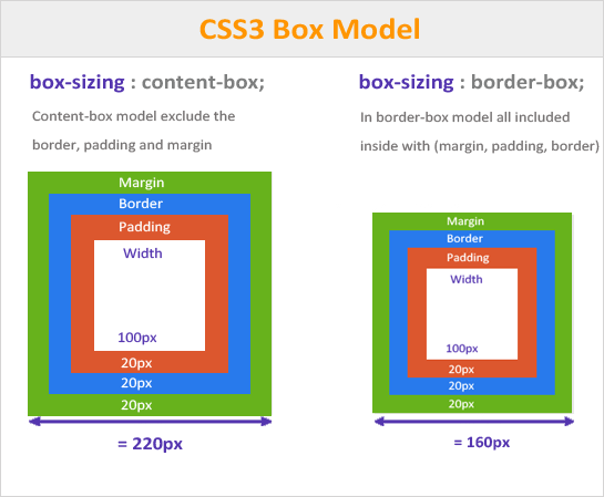
In CSS * is Universal Selector. Using * set margin and padding to 0 & font-family to YourFont. set box-sizing to border-box.
*{
  margin: 0;
  padding: 0;
  box-sizing: border-box;
  font-family: 'Poppins';
}
When you assign border-box to box-sizing and set an element width, you are saying to include padding and border in that width itself, so that element doesn't overflow.
see the difference between border-box and content-box below image.
Body
Set the full background-color to #242132 and text-color to white.
body{
  background-color: #242132;
  color: white;
}
Header
Note : Added a new div, HTML code ->
<div class="headBlock">
      <h1>Welcome to Your Notes 📝</h1>
  </div>
Now set border-radius, background-color, and some other properties.
.headBlock{
  width: 100vw;
  height: 184px;
  border-radius: 20px;
  margin-top: -60px;
  background-color: #4159a5;
  box-shadow: 0px 9px 13px rgb(110 142 195 / 24%);
}
Edit h1 tag in the header.
.headBlock h1{
  font-size: 32px;
  padding-top: 88px;
  display: flex;
  justify-content: center;
}
TextArea and Add Button
Note : Added new div section.
<div class="textAndAddBtn">
      <textarea name="inputAreas" id="inputArea" cols="30" rows="10" placeholder="write your note here!"></textarea>
      <button id="addNoteBtn">Add note</button>
  </div>
Now style the section.
.textAndAddBtn{
  display: flex;
  flex-direction: column;
  align-items: center;
}
Style the text-area and add a button.
textarea{
    height: 70px;
    margin-top: 32px;
    color: white;
    background-color: black;
    width: 220px;
    display: flex;
    margin-bottom: 16px;
}

#addNoteBtn{
    width: 204px;
    height: 36px;
    background-color: #aeffae;
    border-radius: 5px;
    border: none;
}
Add a Hover effect to the button so that when you hover on the button the cursor will be a pointer.
#addNoteBtn:hover{
  cursor: pointer;
}
Note : Added a class to the HR tag.
<hr class="lineBelowAddNote">Add styling to its class.
.lineBelowAddNote{
  width: 100vw;
  margin-top: 20px;
}
Your Notes Heading
Note : Added a class to the H3 tag.
<h3 class="yourNotes">Your Notes</h3>Style the element.
.yourNotes{
  display: flex;
  justify-content: center;
  margin-top: 20px;
}
Designing displayNotes class
.displayNotes{
  display: flex;
  flex-direction: column;
  align-items: center;
  flex-wrap: wrap;
  margin-top: 10px;
}
A small change in JS file
To make the good-looking design I have a div section and its class printsNotes. Replace the below block code with the previous code in the JS file.
listArr.forEach((element, index) => {
      newTagLine += `
      <div class="printsNotes">
      <p>${element}</p>
      <button id="delNoteBtn" onclick="deleteNote(${index})">Delete note</button>
      <hr/>
      <div/>`
  })
Now style all elements present in class "printsNotes"
.printsNotes{
    width: 325px;
    background-color: #37324D;
    margin-top: 4px;
    display: flex;
    flex-direction: column;
    align-items: center;
    overflow-wrap: anywhere;
}

.printsNotes p{
    padding-bottom: 10px;
    text-align: center;
}

.printsNotes button{
    margin-bottom: 10px;
    border-radius: 5px;
    width: 100px;
    height: 32px;
    background: #ff8080;
    color: white;
    border: none;
}

.printsNotes button:hover{
    cursor: pointer;
}

.printsNotes hr{
    width: inherit;
}
Pending tasks and Delete button
Note : Added a new div section.
<div class="tasksAndDeleteBtn">
        <div class="pendingTasks"></div>
        <button class="deleteAll">Delete all</button>
    </div>
- Style the div -> tasksAndDeleteBtn and its elements.
.tasksAndDeleteBtn{
    display: flex;
    flex-direction: column;
    align-items: center;
    margin-top: 10px;
    margin-bottom: 15px;
}

.pendingTasks{
    margin-bottom: 10px;
}

.deleteAll{
    border-radius: 5px;
    width: 100px;
    height: 32px;
    background: #f35454;
    color: white;
    border: none;
}

.deleteAll:hover{
    cursor: pointer;
}
Adding Media Queries
- To make a responsive web app you need to add media queries.
@media (max-width:768px){

    .headBlock{
        width: 360px;
    }

    .headBlock h1{
        font-size: 32px;
        padding-top: 72px;
        padding-left: 25px;
    }

    textarea{
        height: 70px;
        margin-top: 32px;
        color: white;
        background-color: black;
        width: 220px;
    }
}
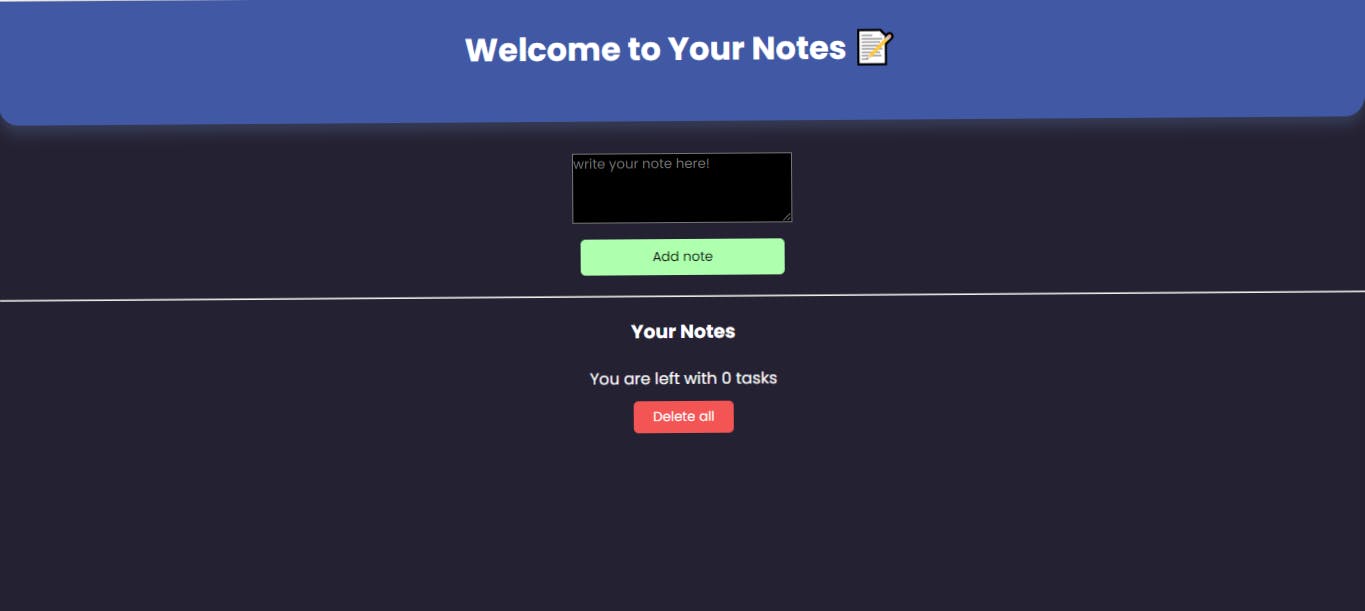
And you are done. Now output should look like this 👇
 Our Todo web App(Frontend + Backend) is completed.
Hope you guys enjoyed both parts.
Our Todo web App(Frontend + Backend) is completed.
Hope you guys enjoyed both parts.
I hope you found the article insightful and informative. Please like/share so that it reaches others as well.
Check out Live App
Let's connect 👇
See you in the next article💗👋